top of page


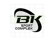


The B.K. logo is designed to embody strength, unity, and a sense of belonging within a strong, connected community.Its rounded and harmonious lines reflect togetherness, collaboration,and a spirit of growing as one.The letters “BK” are bold and easy to read, expressing clarity andconfidence — accompanied by the words “Sport Complex” torepresent its role as a comprehensive sports destination.


Colours
Rebrand Sea Buddy’s Corporate Identity (CI)—from primary and secondary color palettes and graphic elements to typography and artwork—to create a modern, playful aesthetic that resonates with a new generation of health‑focused consumers, positioning Sea Buddy as everyone’s go‑to seafood buddy.
bottom of page